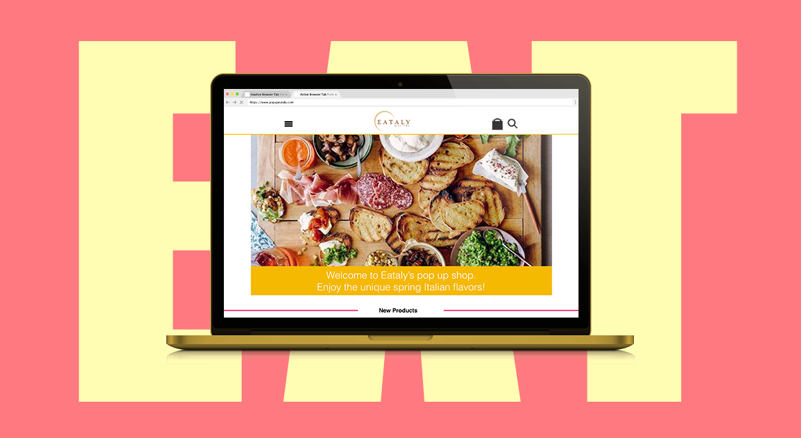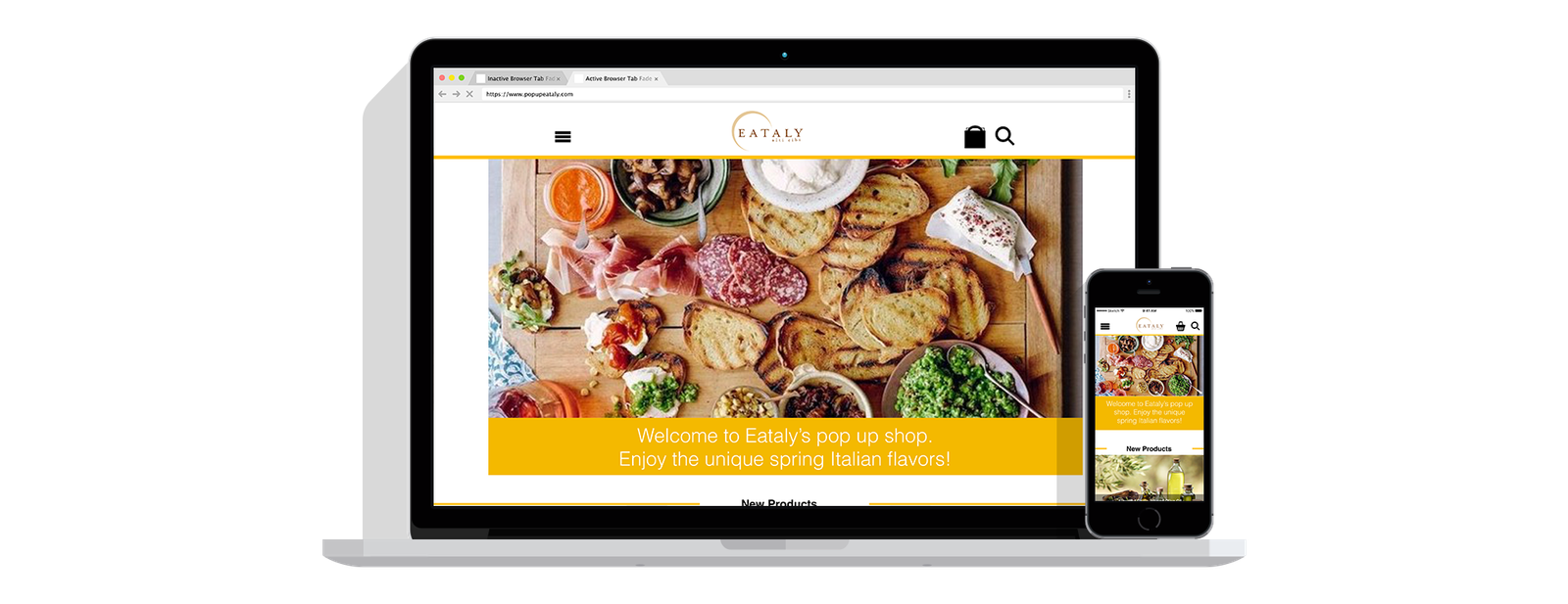
/SERVICE
Visual Identity
eCommerce
App IOS / Android
Photography
/GOAL
Design a responsive ecommerce experience that simplifies product discovery and navigation across Eataly’s extensive product catalog while creating an engaging seasonal shopping experience.
Project Goal
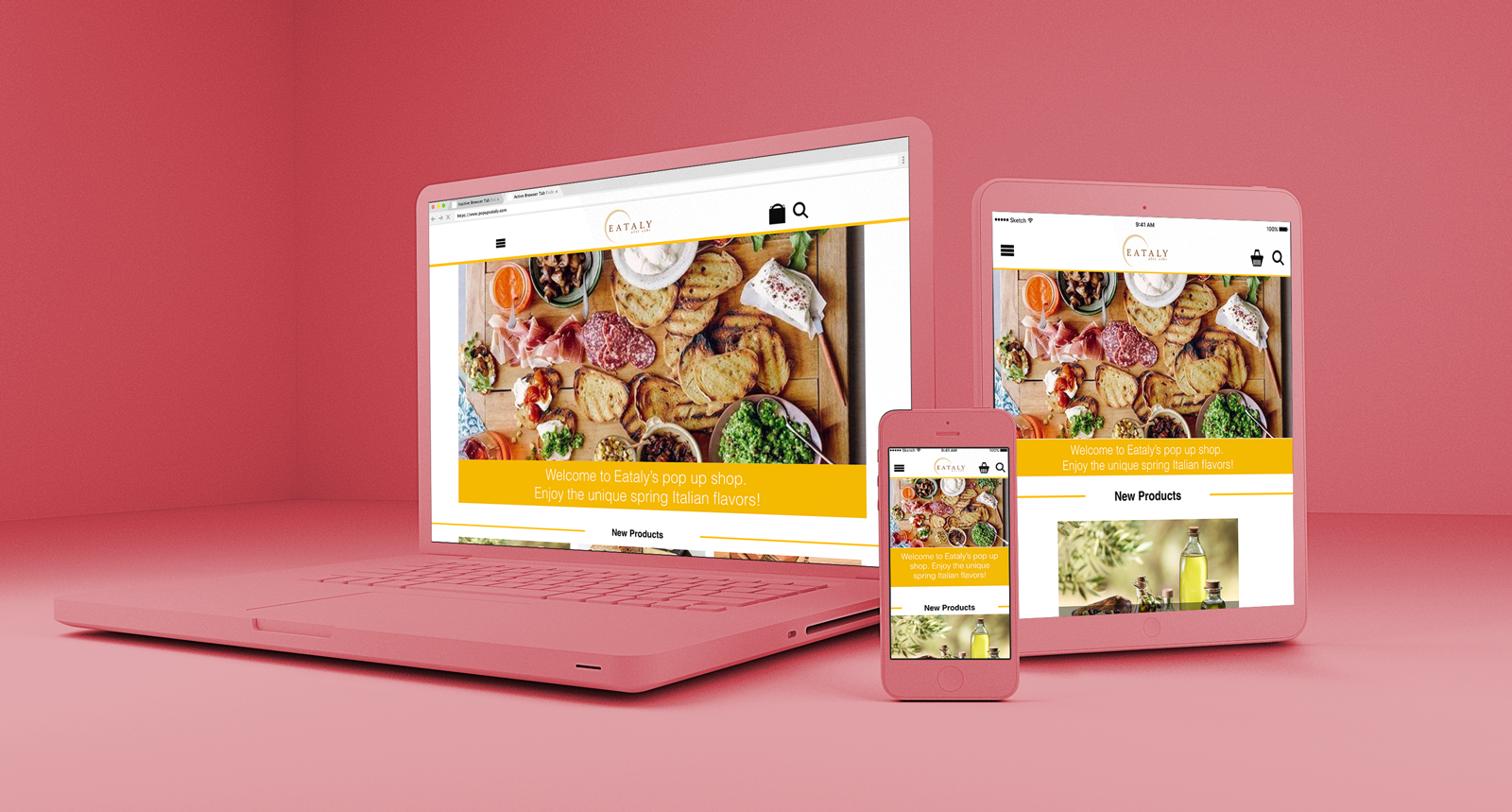
Design a responsive, spring-themed ecommerce experience using User Research and Information Architecture to reduce complexity, improve findability, and create a seamless responsive shopping experience.
Eataly combines a large Italian food marketplace with physical retail locations. The challenge was to translate the breadth of the in-store experience into a focused digital experience that was intuitive, easy to navigate, and aligned with the brand.
/USER RESEARCH
I started with contextual research at Eataly’s physical store and an evaluation of its existing ecommerce experience to understand the brand, product ecosystem, and customer experience.
The research revealed that the physical store carried significantly more products than the website. I organized an inventory of 100 products to understand the complexity of the catalog and identify opportunities to improve digital product discovery.
/INFORMATION ARCHITECTURE
To create a scalable and intuitive structure, I conducted open and closed card sorting to identify meaningful product groupings and validate the proposed navigation.
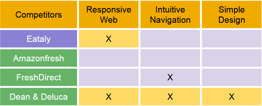
I complemented the research with competitive and comparative analysis to evaluate existing eCommerce patterns and prioritize features for the MVP.
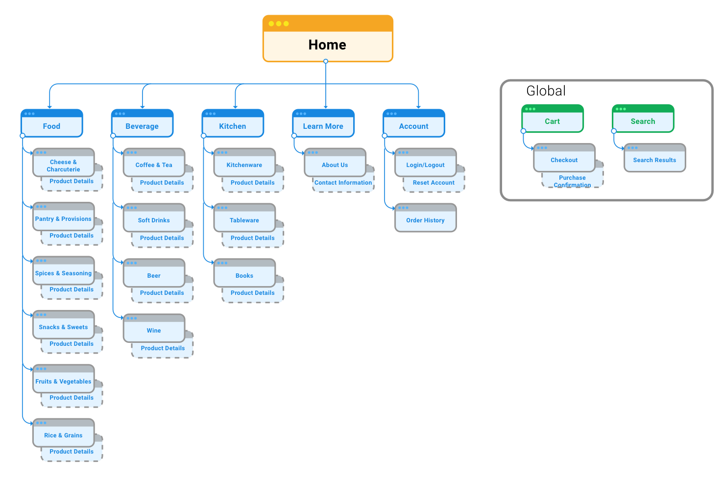
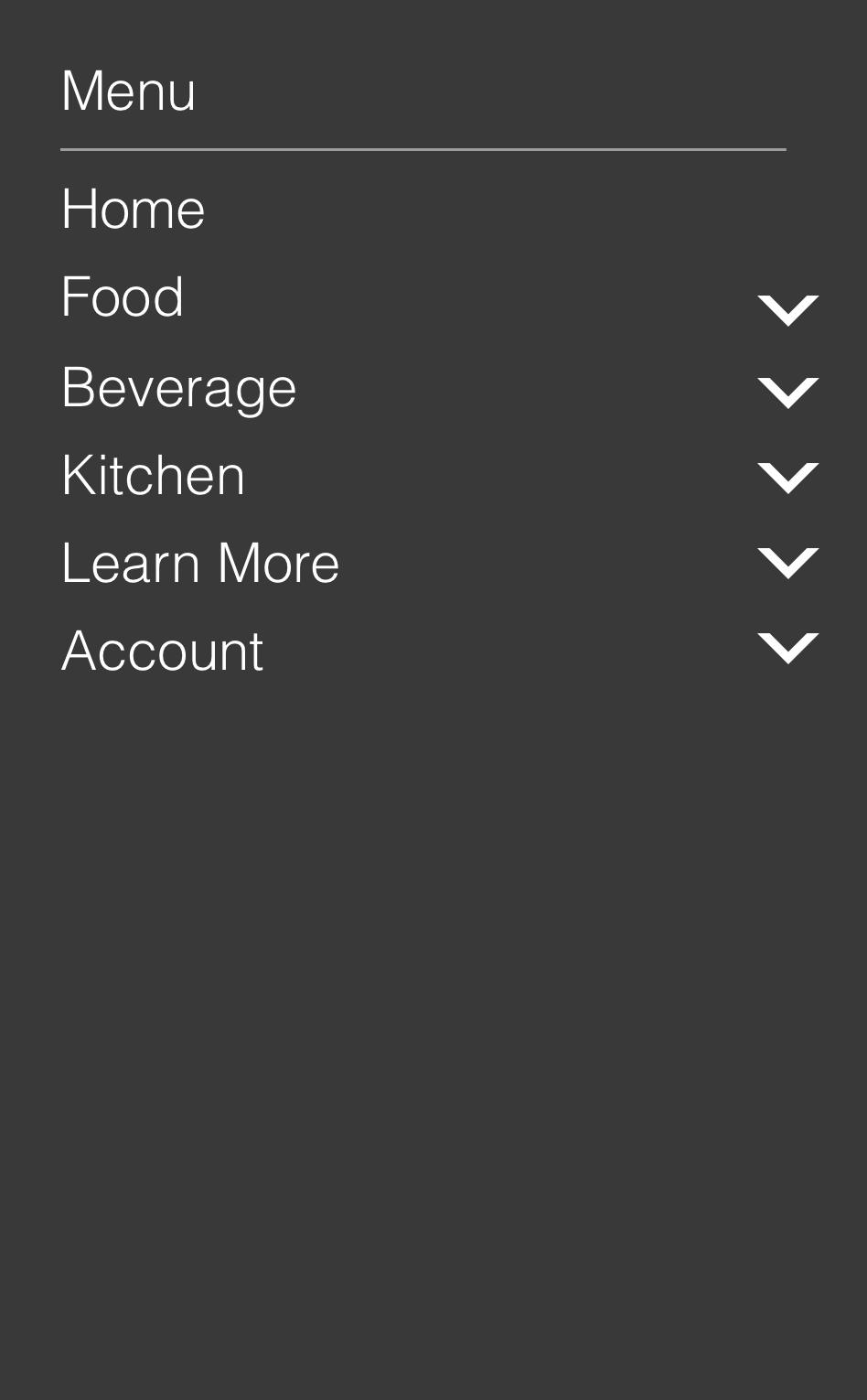
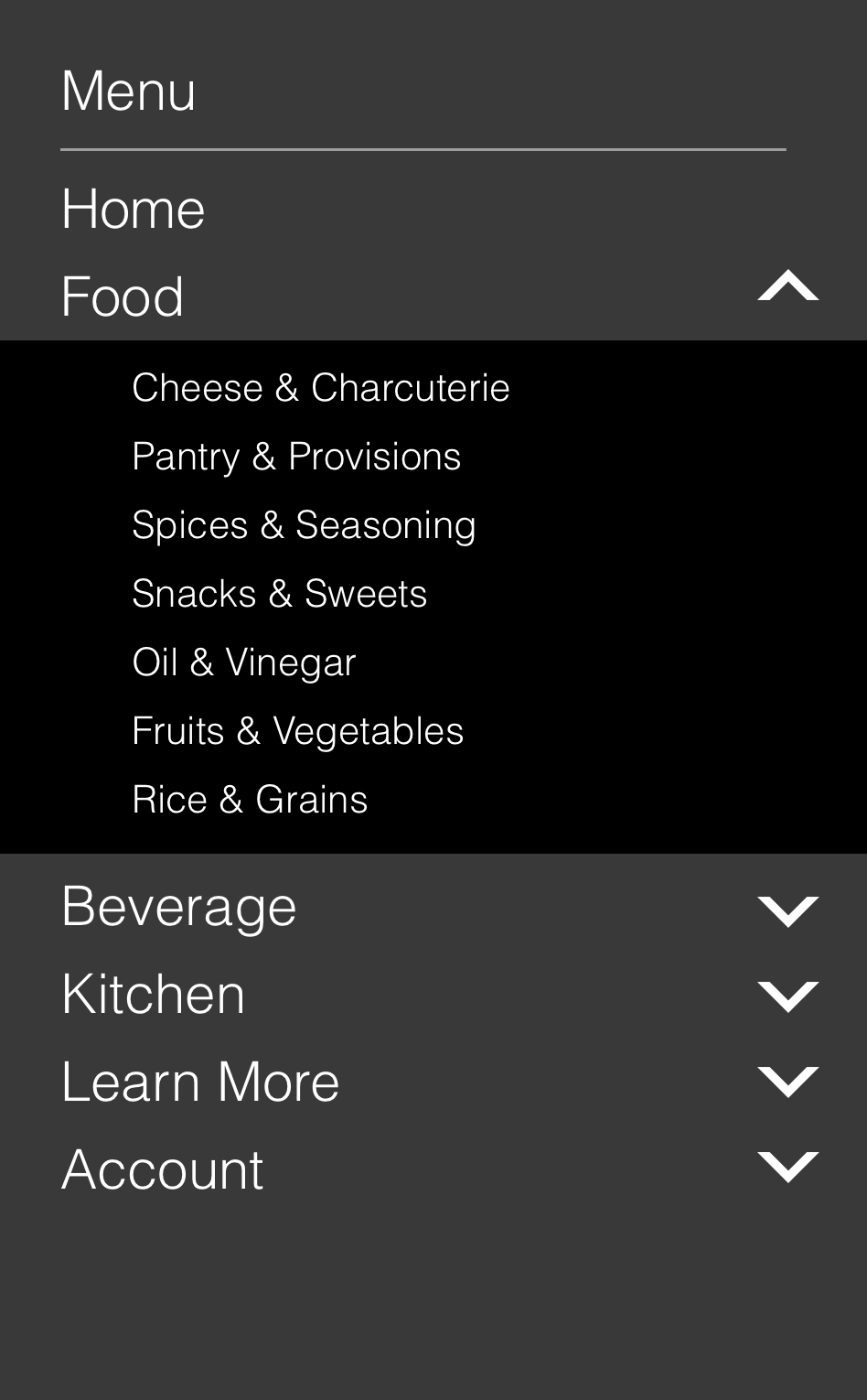
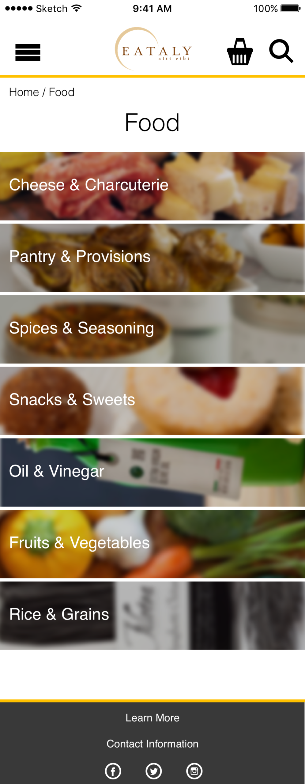
These insights informed a simplified site architecture centered around three primary categories:
Food → Beverage → Kitchen with supporting Learn More and Account sections.
/INTERACTION DESIGN
I translated the research findings into a user-centered information architecture and sitemap, designed to minimize the learning curve and make a large product catalog easier to explore.
The open card sort established initial product groupings, while the closed card sort helped validate the navigation structure and its intuitiveness.
Below is an illustration of the user journey
/WIREFRAMING & PROTOTYPING
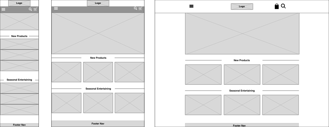
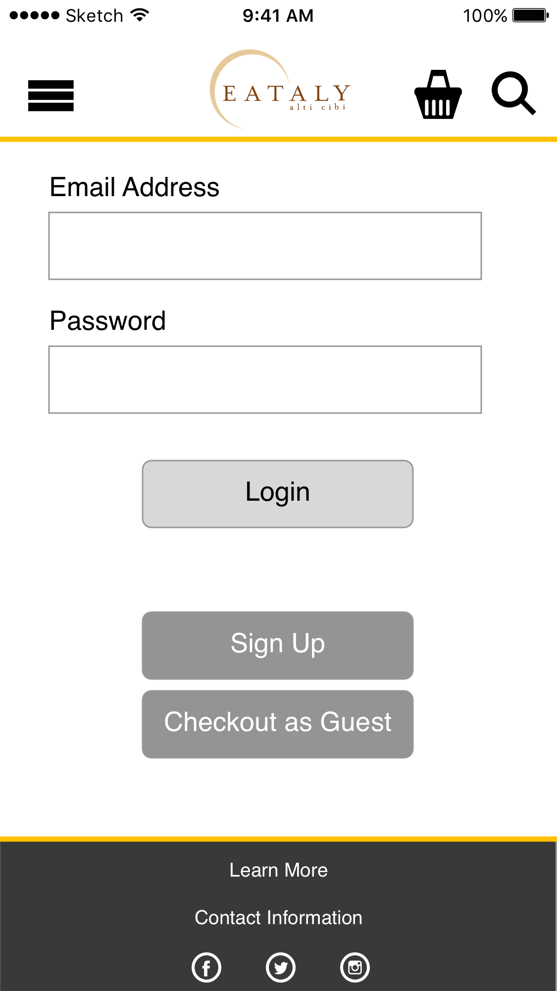
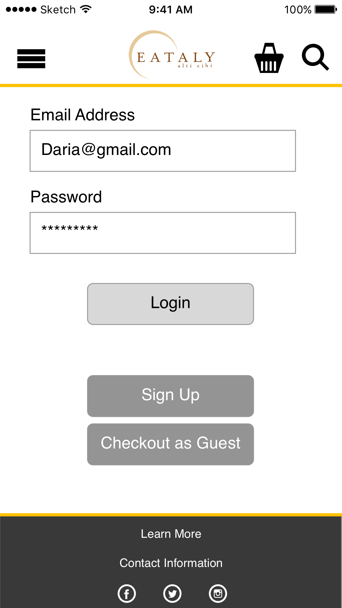
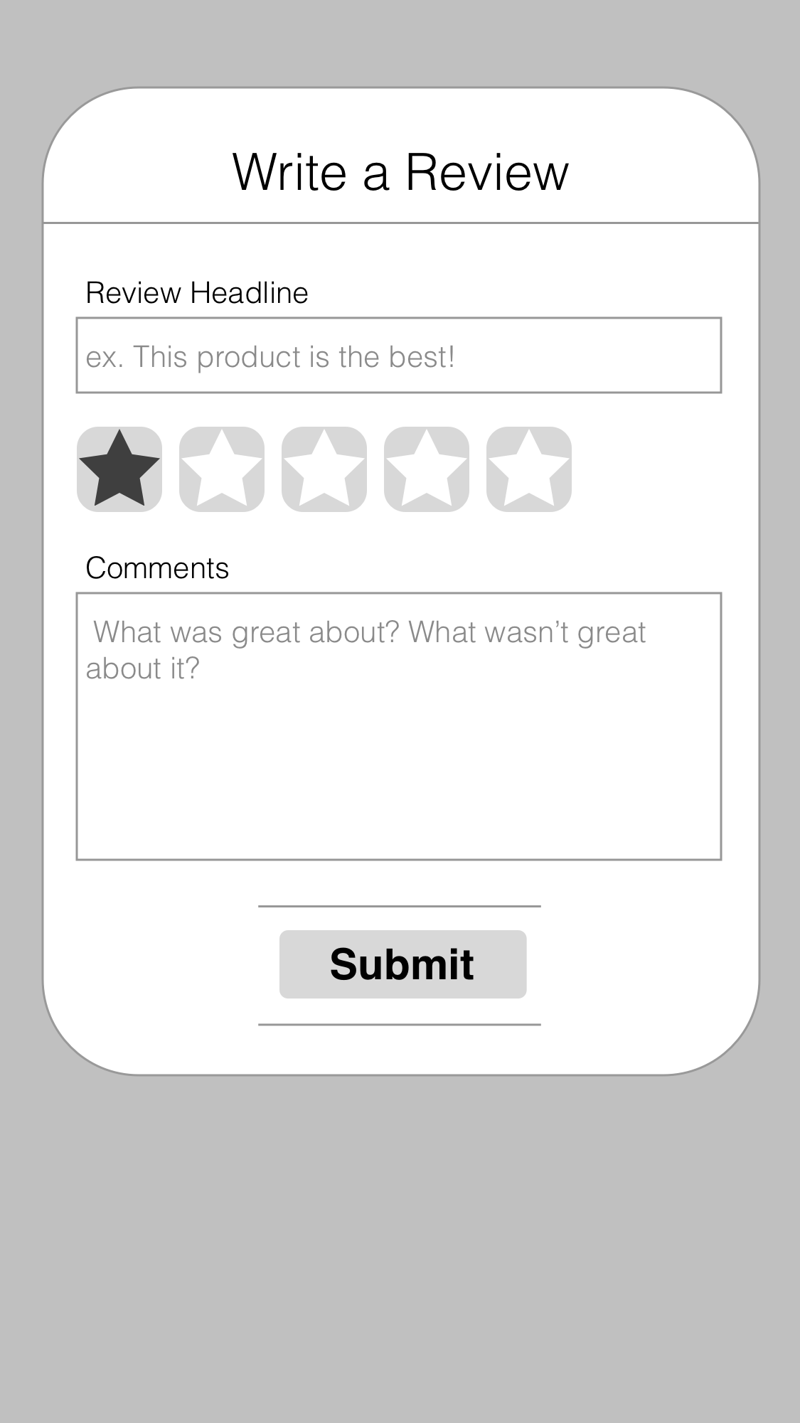
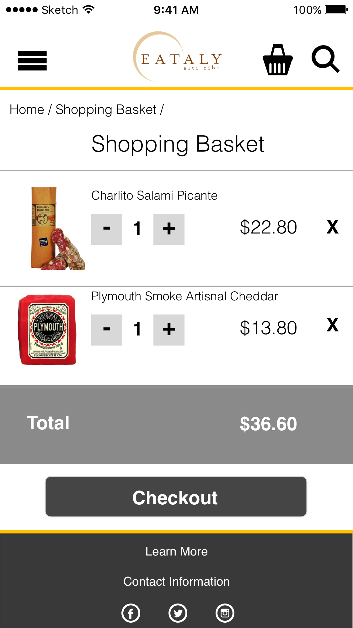
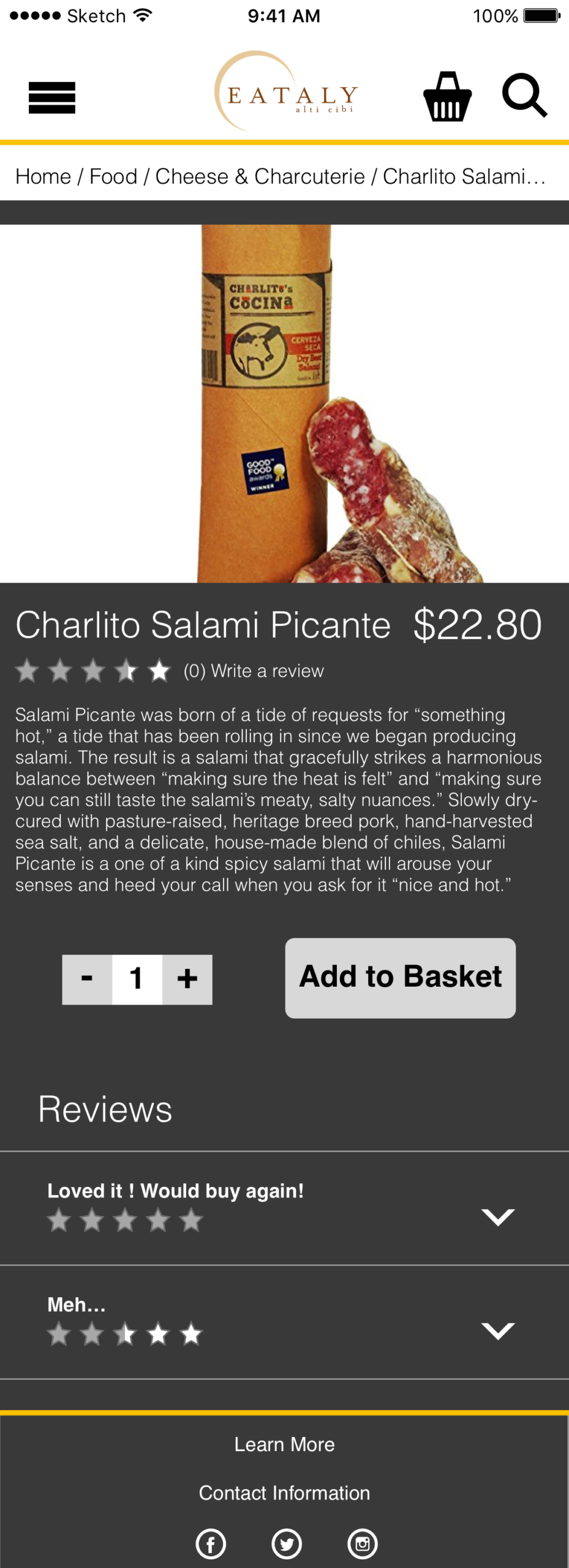
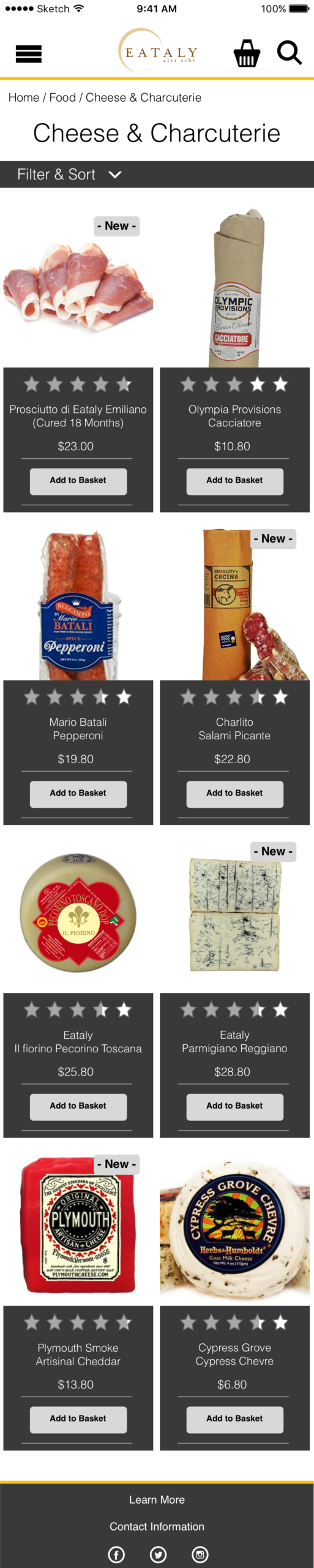
I moved from rapid low-fidelity sketches to high-fidelity wireframes, progressively defining the structure, navigation, and interaction patterns of the experience.
Interactive prototypes were created in InVision and used throughout the design process to evaluate the experience before moving into final visual design.
/USABILITY TESTING & ITERATION
I conducted usability testing between design iterations to evaluate whether users could navigate the experience intuitively and complete key tasks without unnecessary friction.
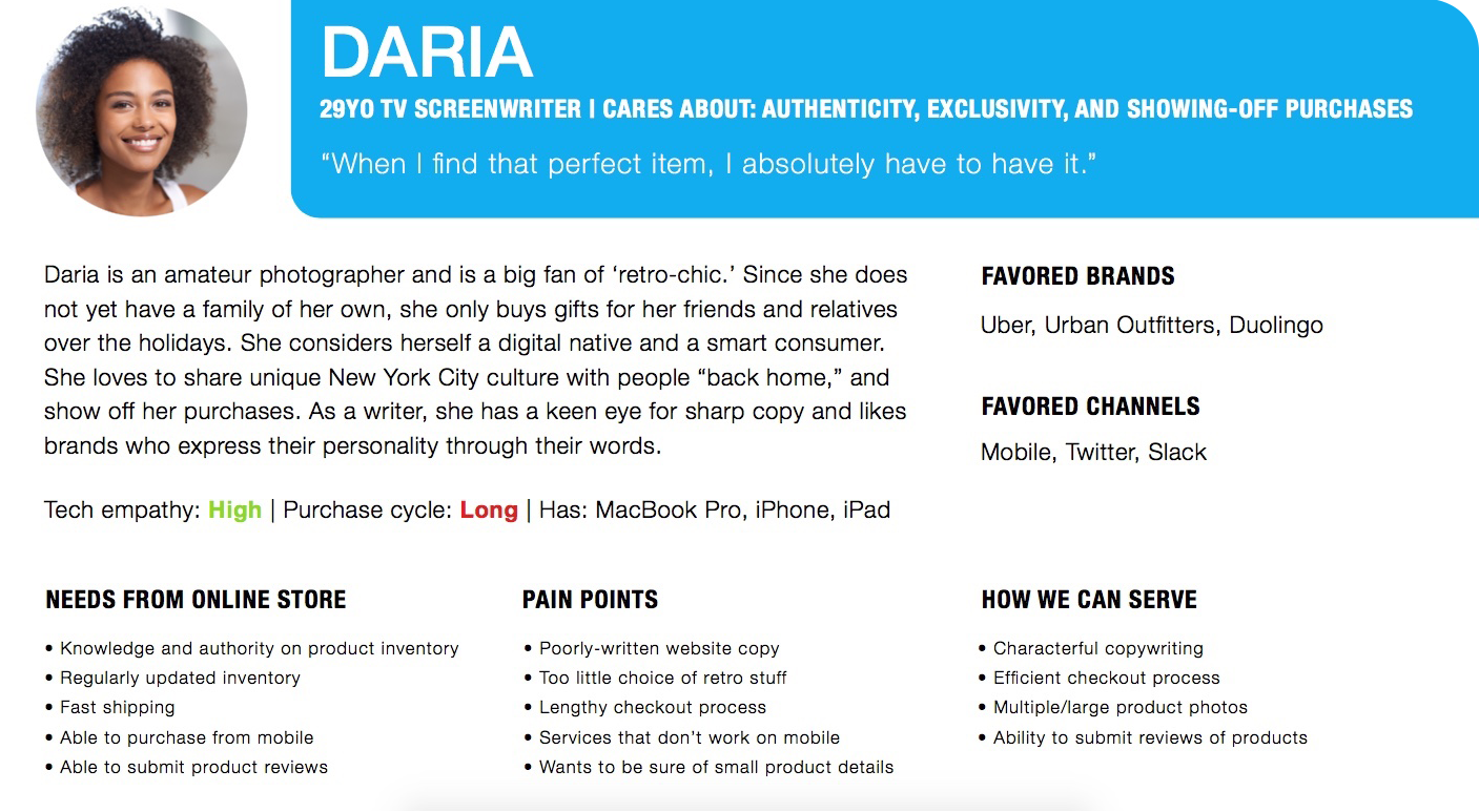
Because the target persona primarily used mobile, I focused testing on the mobile experience and incorporated validated findings across the responsive breakpoints.
This iterative approach allowed the design to evolve based on user feedback rather than assumptions.
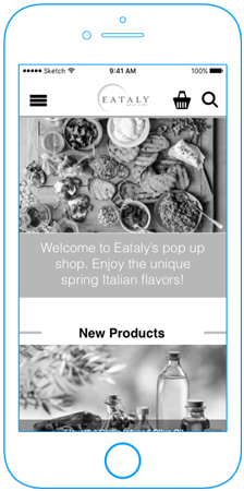
/RESPONSIVE & VISUAL DESIGN
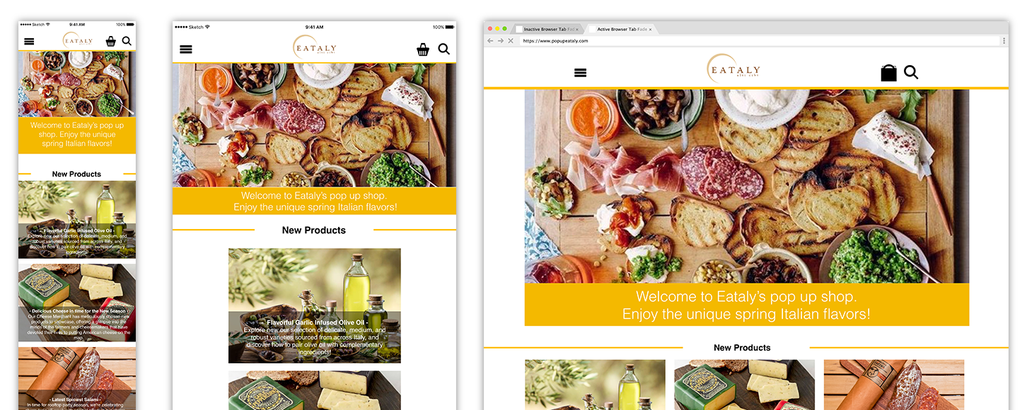
Once the interaction and responsive framework were established, I developed the final visual direction around the spring seasonal theme.
Color, typography, and visual hierarchy were used to create an engaging eCommerce experience while maintaining alignment with Eataly’s existing brand identity.

Selected Works